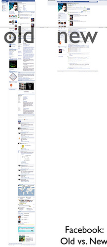
After many months of speculation and veilled warnings issued to application developers, Facebook looks like they are ready to start rolling out their new layout for their social network. Personally, the changes don’t impress me and I expect many people to be upset.
Of course, I’ve only formed that opinion in the past few minutes and I’m sure like many I’ll just “get used to it” in a matter of time. I’d expect Facebook letting people theme their pages, or to offer a variety of sponsored themes, but alas I wasn’t presented with that.
For one, the tabs aren’t easily detectable until you start trying to find the “rest” of your profile.
Here is a basic exercise in usability and consumer advocacy:
As a consumer I want to know WHAT is new, and WHERE is my <fill in the blank>?! When I used the new profile, I didn’t see any kind of education, an overview or heck on why they changed my layout. Perhaps if i could see the benefits from the new profile, I might understand it more and not be so immediately turned off by it.
Surely, the Facebook developers know why they reorganized the profiles, but I (as a user), don’t. Drastic changes like this aren’t intuitive and require proactive communications. Here’s a before and after of my profile:

Now here’s why I bring this up.
Every day at my company (Infusionsoft), we’re continually assessing the user experience and how we can minimize complaints and really make changes a positive experience. I could go on and on about all the aspects of the end-user experience, but I don’t want to make your eyes (or ears) bleed. So again, this reminds me of why I do what I do, why I do it and I get to formalize another anecdote from Facebook. I can’t imagine why Facebook doesnt even have a user-friendly page published with exiting details, but they don’t.
