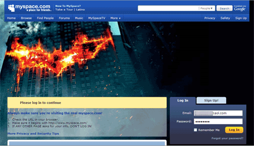
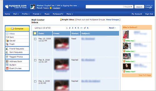
MySpace, the social network that used to carry a very bland traditional theme launched their new Web layout today. It seems to make way for greater functionaly and additional monetization opportunities for the top social networking provider.
The changes were discovered after logging into MySpace and checking out the blog entry from “Tom” (MySpace’s corporate blog account). Oh, it looks really smooth, it works and loads fast.
Looks good. I think they should cool it a bit with the advertising, at least when it comes to launches like this so it doesn’t overwhelm users. Another fringe benefit, the MySpace phishers need to redesign their phishing Web sites.


