Google, Yahoo and Microsoft are the big three email providers that you think of when it comes to web-based email. However, there’s a new kid on the block who ‘aims’ to flex their design muscles for a clean and refined web mail experience: AOL. In late July, AOL formally announced the new changes in their web-based Mail product.
Like you, AOL isn’t my first choice for my email. Their web-based mail app left a lot to be desired and the interface was cluttered with graphical advertising, programmed content and overall was a mess. When the occupational genocides struck the company top to bottom, left to right, numerous talented product development teams were included. It would be correct to say that product pride, innovation and creativity became extinct after this period for the company.
Five years later, they are trying for a comeback.
AOL completely revamped their product in numerous ways. Their launch was quite uneventful. I suggest they need to talk less about the features and newbie topics (e.g.,“ABCs of email”) and more about the benefits for mainstream Mail users — but I digress. They were written up by AllThingsD, VentureBeat and TechCrunch, but not many other publications beyond the tech media. Perhaps the lack of mainstream coverage relates to mainstream relevance. AOL claims to have 24M monthly active users on AOL Mail, while Gmail has an astounding 425M monthly active users.
The product director, Joshua Ramirez, essentially told VB that he wants the AOL Mail product to become the linchpin of growth for the company. Unfortunately, this might be a case of AOL showing up to the email+social party too late. Many people have a negative association with AOL being dated, obsolete and old.
The AOL Mail product has toned down their advertising compared to previous versions of Mail. Users who dislike banner ads can find salvation through the use of Adblock Plus and still thoroughly enjoy AOL Mail.
There are a number of great changes that I’m excited about. Underlying all of them is a discipline to not clutter the experience and actually empower the user with sophisticated email controls combined with the cliché of ease of use that AOL is known for.
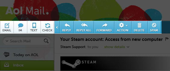
Elegant Controls
The controls are bold, crisp and direct. Users may optionally turn off the labels, but I actually don’t mind. Combined with the Museo font, these look great. Also, note that the Spam button is not as prominent as the delete button. This helps users who inadvertently wipe out their inbox and harmfully send legitimate senders to the spam folder.
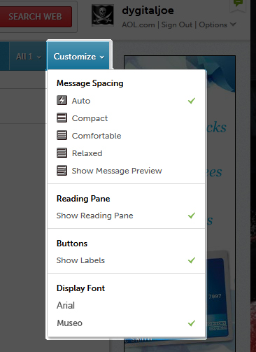
Customizable Display
You’ll notice some similarities between Gmail and AOL with empowering users to customize the display. The dropdown menu is just a click away so you don’t need to spend time fumbling with the controls. It defaults on “Auto.”
Responsive Layout
This feature is more technical in nature; it means the Mail interface is very attractive and usable for people on a variety of resolutions and screen sizes. The Mail interface resizes and degrades gracefully when shrunken or expanded.
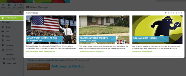
Programmed Content
The content is simple, to the point and not loaded with advertorials. Content is sourced from AOL’s myriad of content providers. I can tell the descriptions are unique and there’s someone behind the scenes programming it. Think of it as a very light version of the AOL Welcome Screen.
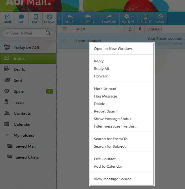
Powerful Email Controls
In car terms, AOL has been that three-speed automatic Escort – it got you to your destination, but lacked style. Well, it appears they have a new gearbox for users to play with. You can now access a context menu via right-click (Command+Click on Mac) or the Actions button. The menu enables you to easily find related messages in your account, create filters and more. This feature rivals Gmail’s filters! I found setting up the controls a breeze.
What Don’t I Like?
AOL is still “phasing” in the new layout among users. For instance, only half of my (five other) accounts are on this new interface. This “break-in” period has lasted for the better part of a few months and I feel they aren’t making a big enough splash with this change. Silently phasing the rollout to users is a disservice to this new evolution of AOL Mail. Also, the banner advertisement is considerably large. I know it pays the bills, but I feel with a product change this significant, it’s high time to give users the choice between relevant text-based ads or graphical ones.
I’ll admit that I’m biased when it comes to AOL products. I’ve always wanted AOL products to succeed with people. I was a former AOLer who actually enjoyed the software, service and the community. Today I’m an avid Google products user and I rarely visit AOL properties. I love to tinker with apps and customize them to my needs. With these changes, I’ll consider using my AOL account again.
You should check it out and let me know what you think.


